Thursday 27 April 2017

RESPONSIVE EVALUATION


Overall the main principle learnings I have taken from Responsive module is the ability to take initiative and work within a professional environment. I can directly link all of them as learning experiences, each to their own merit. Through these briefs I have deepened my practice on time management. Certainly collaborating has broadened my cognitive understanding. I would like to understand coding more, as I believe it will be an important skill to have in the future, it is also a well paying sector in the working industries. I have seen some graduate internship jobs going for as high as £40,000 a year. So this is a potential prospect. Which is another major point in my learnings from these briefs. I have shown my true direction in these modules. In the future I do not see myself in one specific role. I don’t want to label myself as a graphic designer because there are many other creative outlets I shall pursue. Which I made a huge point of in my presentation. These briefs were an example of this. I do not have the same skills as an interior designer but in my interior design brief I used my skills as a graphic designer and put it to a different practice. Which also can make my style in this sector unique, and separates me from my competitors. In this brief I have discovered future prospects through self discovery, really taking control of my learning and drawing a creative path to follow into next year. I don’t think I have a distinctive style which I prefer as I would like to be as versatile as possible as a creative. This brief showed my versatility, and strengthened it as well as teach me to revaluate my social skills and perhaps next time to enforce my ideology further, instead of shying away from a conflict of interests.

COLLABORATION CONTRACT

ROSHAN TAKHAR & WILF DESSENT
TITLE: LOOPDELOOP

WHY HAVE YOU CHOSEN TO WORK WITH YOUR CREATIVE PARTNER? WHAT ARE YOUR AIMS?

ROSHAN:

- learn new skills and approaches 
- step out of comfort zone and push myself into new ways of working

WILF:

- utilise and learn from partners skill in adobe applications
- create a unique loop animation

WHAT ARE YOUR SPECIFIC AREAS OF CREATIVE INTEREST IN THIS BRIEF? 

ROSHAN:

- create a loop animation with a mixture of both styles 

WILF:

- make an interesting animation with a clash of styles 

WHAT SPECIFIC DESIGN SKILLS DO YOU HAVE TO OFFER IN RELATION TO YOUR CHOSEN BRIEF? HOW DO YOU INTEND TO USE THEM?

ROSHAN:

- knowledge of a number of adobe applications


WILF:

- strong illustratively, with a much different creative process to offer

WHAT SPECIFIC NON-DESIGN SKILLS DO YOU HAVE TO OFFER IN RELATION TO YOUE CHOSEN BRIEF? HOW DO YOU INTEND TO USE THEM?

ROSHAN:

- awareness of time management
- can hold a professional demeanor
- greater awareness of time management 
- can organise set tasks and assign roles well 

WILF:

- individual innovative ways of working which I can share with my design partner 

WHAT WILL YOUR SPECIFIC ROLES BE IN THE COLLABORATION IN RELATION TO YOUR BRIEF?

ROSHAN:

- animate 
- design background
- design egg

WILF:

- animate
- design chicken 

WHAT WILL YOUR INDIVIDUAL RESPONSIBILITIES BE IN RELATION TO YOUR BRIEF?

ROSHAN:

- manage time 
- communicate constantly 
- offer consistent feedback 

WILF:

- create a design which is innovative and pays homage to my own individual style 
- communicate on a consistent basis 

WHAT WILL YOUR JOINT RESPONSIBILITIES BE?

ROSHAN & WILF:

- create a concept which we both agree on, work together informing each other on any issues or disagreements and agreements based on the project. Animate the loop together. 


Wednesday 26 April 2017

PENGUIN AWARD BRIEF

Emiliano Ponzi:

South Bank Tower Illustration

See this Instagram photo by @thefoxisblack • 745 likes:

Artist: Stephan Schmitz:

Patrick Caulfield - Window at Night 1969:

Patrick Caulfield - Window at Night 1969

Windows of New York absolutely gorgeous..I love the Orchard street window!:

Edward Hopper, Cape Cod Morning, 1950:

Rachel Idzerda:

Malika is a French illustrator/art director based in East London. She grew up in Paris where she studied graphic design before moving to London to pursue illustration. She joined Airside in 2006, a highly acclaimed multidisciplinary design studio. Having left Airside in 2011 Malika is now established as one of the most sought after illustrators …:

Atticus maxim which he tries to teach the children. By the end of the book, Scout has learnt her lesson as she stands from the Radley Porch and is metaphorically and literally seeing Maycomb from Boo's perspective.
27w


Atticus maxim which he tries to teach the children. By the end of the book, Scout has learnt her lesson as she stands from the Radley Porch and is metaphorically and literally seeing Maycomb from Boo's perspective.:

COLLABORATION

Define what is your motivation for undertaking your collaboration?

To learn and enhance my skills in a different area of creative practice, to evolve as a designer.

What methods of communication will you use and how often will you meet?

Probably have an on-going conversation through college and online to keep each other up to date on latest findings and processes.

What skill-sets does each member of your collaboration team bring?

I haven't got a member yet but I would like each member to have a diverse skill-set and mindset that is different to mine so there is a more well rounded response to the set brief.

TYPOGRAPHIC AD EXAMPLES

https://www.youtube.com/watch?v=qK4Re_ArS3Q

https://www.youtube.com/watch?v=J59n8FsoRLE

https://www.youtube.com/watch?v=8fsH8qxDDY4

https://www.youtube.com/watch?v=HP0Fglg76IE

https://www.youtube.com/watch?v=TJ1SDXbij8Y

https://www.youtube.com/watch?v=GeoUELDgyM4&t=36s

POSTER'S USE AS PROMOTION

For several reasons, promotion is a key factor in the success of a special event. The main purpose that promotion serves is to attract participants, spectators or both to the event. A football match without a crowd is always disappointing and so is a local tennis tournament with only half the expected number of players. It is essential therefore that the efforts of many people over many months to organise a special event 


Reasons to use flyers for your special event:

Reach your audience:
Flyers provide a great platform to promote special events and reach your audience in many ways including:
• Door to door mail drop
• Newspaper insert
• Street distribution
• Instore distribution
Something tangible:
Another big benefit of using a flyer to promote an event is its tangible nature. The fact that your customers will physically hold the flyer means you are half way to getting your message across. How your flyer is designed and printed can impact on whether or not your customer decides to read on to find out more information. This is why it’s important to make your flyer stand out but also ensure your main message is clear and easy to see. Flyers also allow you to benefit from a quality print finish which can make a big difference when it comes to your customer grabbing it to read.
Incentives:
A flyer also provides you with the space to include incentives such as coupon codes and vouchers. This is a great way to try and drum up some interest in your event and also create some early awareness. Use your flyer as an incentive mechanism by providing discount to the first 20 people who use a certain coupon code.
Measurable:
Coupon codes can often be a great way of measuring how successful your marketing campaign has been. Use your flyer as a measurement tool to establish how successful your event was and what you can learn for the future. 

APPLE'S MOTION GRAPHICS

https://www.youtube.com/watch?v=qK4Re_ArS3Q

Apples Motion Graphics video is so good. It really works through it's simplicity. Below you can see some screenshots and above is the link.

Related image
Related image
Image result for apple motion graphics

Through creating a minimal design, which allows for creative practice however with focus on the typography, this animation hooks you in throughout. No massive typography needed, or imagery it works effortlessly in such an Apple way. I want to produce a similar design, however with my own content inspired. Focusing on racial profiling and trumps recent controversial actions in my animation however as the brief is mainly typography focused I thought this style would work best.

It does not use much flashy typography it's typeface is Callibri throughout I think, and yet it still works at conveying it's message strongly through it's specific use of motion and sound. The way in which it was created enhances the overall animation. Through using motion graphics you are fixed still on the content and the typography, it all allows to convey a more sophisticated tone. As my video will be a serious approach this sort of style I believe is needed. 


I do not think it has been done before...

Campaign ads are more based on social values or an epidemic.

Image result for racism adImage result for water aid ad

This water aid above is a classic example. Campaigns such as these mainly rely on either imagery and sound i.e: the person speaking to the audience (monologue) It is an interesting step to use the same purpose of these ads however only being able to present it with a typographic focus. 
  

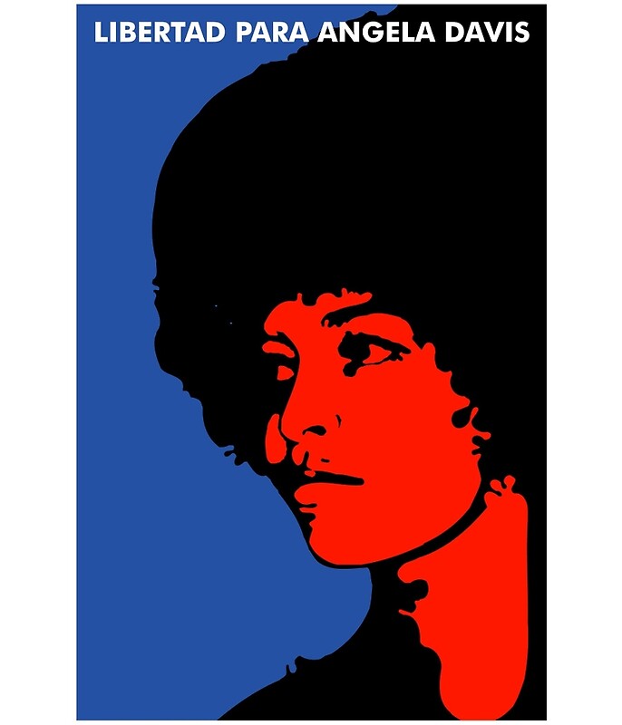
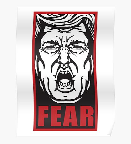
POLITICAL POSTERS EXAMPLES

Image result for political posters

Image result for political posters

Image result for famous political posters


Related image

Related image

Related image


Image result for famous political posters


Image result for trump posters

Image result for trump posters

Related image

Related image


Image result for drenge album poster


GERMAN TYPOGRAPHY RESEARCH

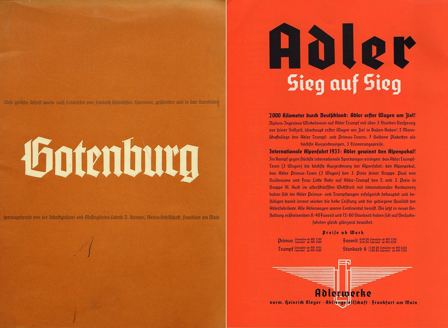
schaftstiefelgrotesk.jpg

Two examples of the modernized blackletter typefaces of the 1930s. Left: Gotenburg, right: Element

Kurrent is a style of connected hand-writing that was used between the 15th and 20th century, especially in the countries using the German language. The style is based on late medieval cursive writing and can be understood as the written counterpart to blackletter typefaces …

Type foundries also reacted quickly to the ideological influence on the type use. Shortly after the Nazis gained power, a new style of modernized blackletter typefaces was offered from various foundries. It is now colloquially known as Schaftstiefelgrotesk (“combat boot sans serif”). This name also shows how strong the connotations between the type style and politics of the Nazi era still are. 


#BLACKLIVESMATTER

http://blacklivesmatter.com/about/

Black Lives Matter is a chapter-based national organization working for the validity of Black life. We are working to (re)build the Black liberation movement.
This is Not a Moment, but a Movement.
#BlackLivesMatter was created in 2012 after Trayvon Martin’s murderer, George Zimmerman, was acquitted for his crime, and dead 17-year old Trayvon was posthumously placed on trial for his own murder. Rooted in the experiences of Black people in this country who actively resist our dehumanization, #BlackLivesMatter is a call to action and a response to the virulent anti-Black racism that permeates our society.Black Lives Matter is a unique contribution that goes beyond extrajudicial killings of Black people by police and vigilantes.

SAN FRANCISCO — International Development Exchange (IDEX) and the Black Lives Matter Global Network (BLM) are pleased to announce a new partnership that reflects the global spread of the movement for Black lives.  
IDEX and BLM will support one another with the goals of promoting social change within marginalized communities. A 30-year-old international grantmaking organization, IDEX provides fiduciary oversight, financial management, and other administrative services to BLM. As a 501(c)(3) public charity, IDEX can receive grants and tax-deductible donations and gifts on behalf of BLM. 

THE NASA STANDARD GRAPHICS MODEL

Experimenting with placement and size was vital to achieving a professional, sophisticated design. Trying to make it uncluttered to achieve a harmony in it’s design, as the placement needed correcting from the current design. Correct placing of the electronic passport, to the typeface and emblem needed to be rearranged. The Nasa Graphic Standards Manual was an excellent resource in trying to understand how to create a graphical impact whilst remaining sophisticated. I believe the qualities and techniques Danne & Blackburn used in redesigning something as complex as spacecraft for Nasa aren’t so different to redesigning a passport.


NASA Graphics Standards Manual reissue

NASA Graphics Standards Manual reissue

NASA Graphics Standards Manual reissue

About

The NASA Graphics Standards Manual by Richard Danne and Bruce Blackburn is a futuristic vision for an agency at the cutting edge of science and exploration.
The book features a foreword by Richard Danne, an essay by Christopher Bonanos, scans of the original manual (from Danne’s personal copy), reproductions of the original NASA 35mm slide presentation, and scans of the ‘Managers Guide’, a follow up booklet distributed by NASA.

FINAL DEZEEN DESIGN


Overall I believe the design depicts an appropriate sense of ‘britishness’ to the redesign with modern design concepts applied, to bring a sense of clarity and harmony to the design, which it was lacking in previous designs. The semantics behind the design such as the deep rooted meaning behind the choice of colour scheme and typeface further enhances the appropriation for this design. Thus demonstrating an overall combination of a strong overall idea, good execution, practicality and a convincing justification for their design.


DESEEN PASSPORT BRIEF

Dezeen launches Brexit Passport Design Competition


What should the UK passport look like after Brexit? 
Dezeen has launched an unofficial competition to redesign the document that all UK citizens carry when travelling abroad. We are looking for designs that present a positive vision of the post-Brexit UK to the world, and that represent all its citizens.


Traditional British Colours - Orders


An account of the Order of the Garter, with its distinctive blue sash was given, and this was followed by a description and background to the Orders of The Thistle (green), St Patrick (light blue) and the Order of the Bath (red). Each of these colours had been matched and confirmed at the Central Chancery of the Orders of Knighthood at St James’s Palace, in London.

Image result for norway passportImage result for norway passport
Image result for norway passport


Time for other countries to step it up.
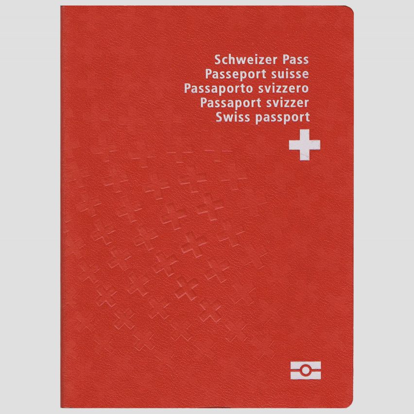
There's nothing that screams "Norway" more wholeheartedly than the country's passport design. Whether you're a fan of minimalist composition or not, you have to admit that the travel document is a straight-up work of art compared to the deep blue jackets of the United States' version (and many other varieties around the world)

Image result for blue uk passport


Traditional British Colours - tartan

The book Traditional British Colours was issued by the British Colour Council in commemoration of the Coronation of His Majesty King George VI and Her Majesty Queen Elizabeth. 
The Foreword tells us that:

“Here are illustrated colours which for centuries have been bound up with the history of Britain. Our national pride and patriotism demands that we should cherish these colours as part of our national life and preserve them in all the freshness and beauty of their original state for future generations.

Of many of the colours, strange and wonderful tales are told, stories which stir the imagination and recall the glories of the past; something of the meaning and history of these colours is given in the following pages, while the actual colours have been faithfully reproduced on ribbon from actual records of flags, banners and orders preserved throughout the ages.”

Some people have called for the post-Brexit passport to be blue, the colour used for British passports before the UK joined the EEC, now the European Union. It seems like the most suitable option, as a way of going back to original values, and dictating to the world that we are a single nation, it provides a statement.


To provide a clean cut design for the British crest I wanted to resemble more of the £1 coin instead of just the crest as analysing the current design shows me that the crest does not work by itself, there is a lack of symmetry and precision. 


Experimenting with placement and size was vital to achieving a professional, sophisticated design. Trying to make it uncluttered to achieve a harmony in it’s design, as the placement needed correcting from the current design. Correct placing of the electronic passport, to the typeface and emblem needed to be rearranged. The Nasa Graphic Standards Manual was an excellent resource in trying to understand how to create a graphical impact whilst remaining sophisticated. I believe the qualities and techniques Danne & Blackburn used in redesigning something as complex as spacecraft for Nasa aren’t so different to redesigning a passport.


A specialised grid format was used to ensure clarity, efficiency, economy and consistency. My grids allowed a guide to the placement of information and help generate visual hierarchy. It has promoted rhythm and consistency in my design and helps in developing a relationship between elements based on rational proportions.


TYPE TEST


A typeface test was undertaken, selecting from classic serif British typefaces, these were the most appropriate typefaces to choose from. They also bare the most resemblance to the current passport typeface. Eventually deciding with Times Roman due to it being in the middle of the two. Caslon is too thin it does not provide emphasis. Baskerville is perhaps too in your face, Times is successful balance of the two. 


FEEDBACK:

After a longwinded selection process, this was the preferred design. I set up a final crit with 5 students in which this design was chosen many stating it was the most visually satisfying in terms of placement and arrangement. A number of experimented designs were undertaken but the key word being visually satisfying echoing throughout the crits made choosing this design much easier. The darker colour was seen as more sophisticated and truer to British values and a representation of the British Tartan colour chart. 


FINAL POSTER DESIGN MONOTYPE

The poster needed to be more artistic and engaging. A poster that adopts the same style as the animation would’ve been less engaging. In term’s of making it relative as a project the colour scheme remains consistent throughout using black,white and red as the only source colours. Red being used as the primary as it is a emotionally intense colour, and acts as a red flag of mutiny and rebellion.