
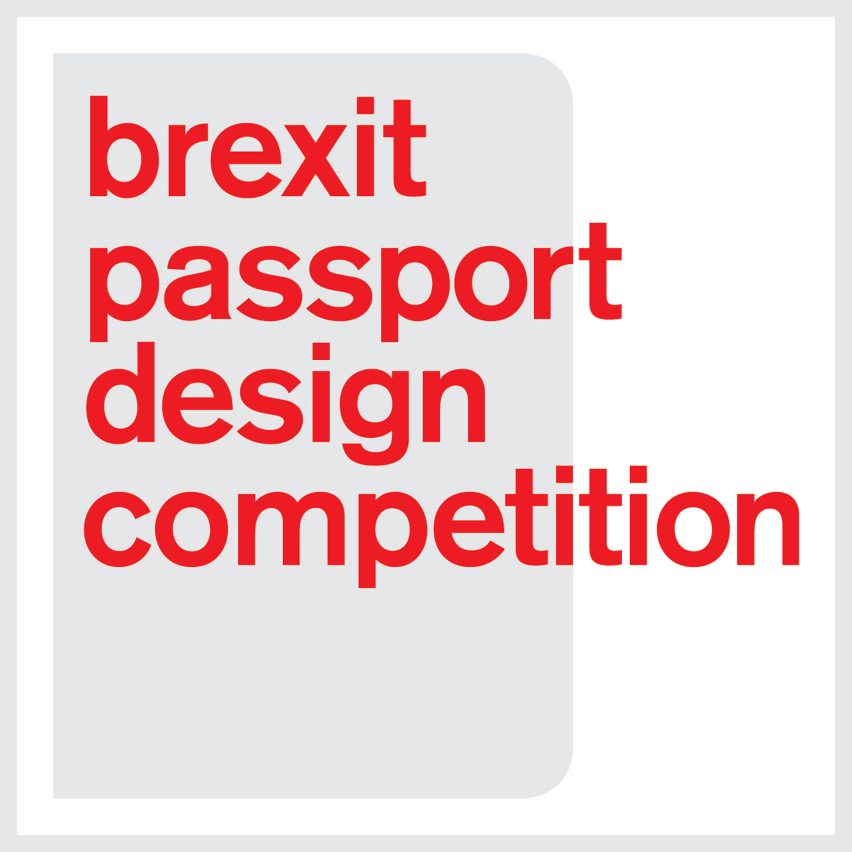
What should the UK passport look like after Brexit?
Dezeen has launched an unofficial competition to redesign the document that all UK citizens carry when travelling abroad. We are looking for designs that present a positive vision of the post-Brexit UK to the world, and that represent all its citizens.

An account of the Order of the Garter, with its distinctive blue sash was given, and this was followed by a description and background to the Orders of The Thistle (green), St Patrick (light blue) and the Order of the Bath (red). Each of these colours had been matched and confirmed at the Central Chancery of the Orders of Knighthood at St James’s Palace, in London.


The book Traditional British Colours was issued by the British Colour Council in commemoration of the Coronation of His Majesty King George VI and Her Majesty Queen Elizabeth.
The Foreword tells us that:
“Here are illustrated colours which for centuries have been bound up with the history of Britain. Our national pride and patriotism demands that we should cherish these colours as part of our national life and preserve them in all the freshness and beauty of their original state for future generations.
Of many of the colours, strange and wonderful tales are told, stories which stir the imagination and recall the glories of the past; something of the meaning and history of these colours is given in the following pages, while the actual colours have been faithfully reproduced on ribbon from actual records of flags, banners and orders preserved throughout the ages.”
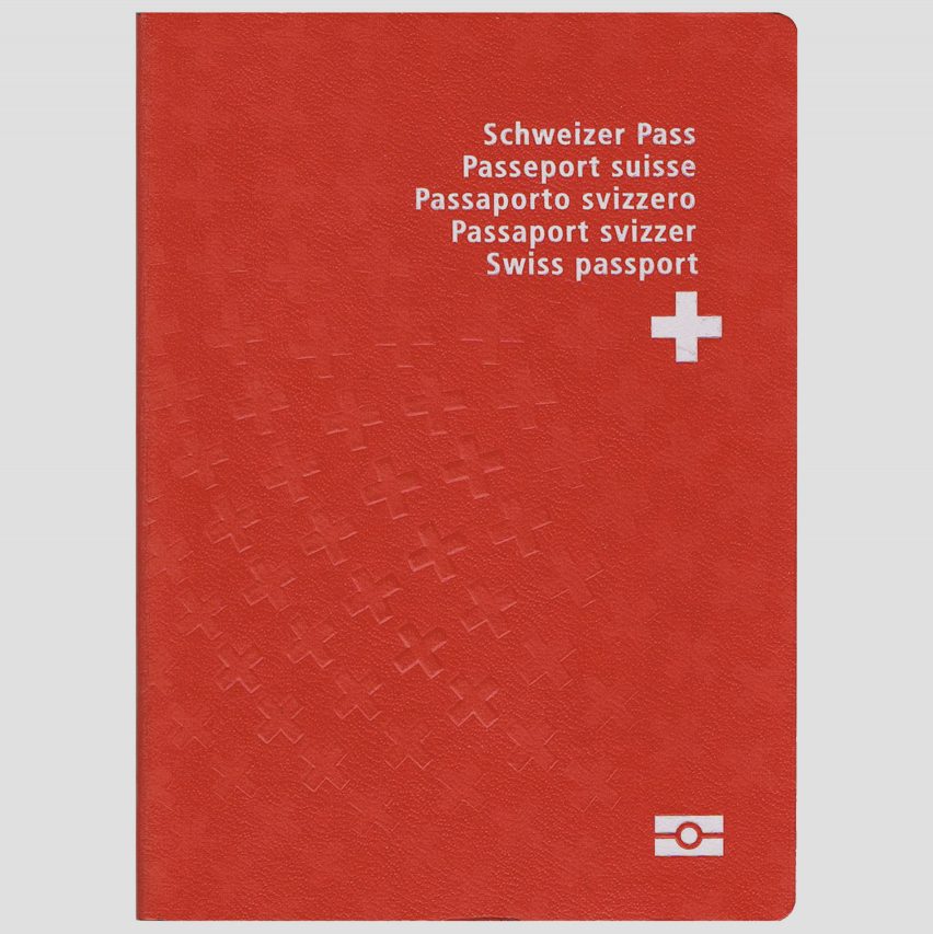
Some people have called for the post-Brexit passport to be blue, the colour used for British passports before the UK joined the EEC, now the European Union. It seems like the most suitable option, as a way of going back to original values, and dictating to the world that we are a single nation, it provides a statement.

To provide a clean cut design for the British crest I wanted to resemble more of the £1 coin instead of just the crest as analysing the current design shows me that the crest does not work by itself, there is a lack of symmetry and precision.


Experimenting with placement and size was vital to achieving a professional, sophisticated design. Trying to make it uncluttered to achieve a harmony in it’s design, as the placement needed correcting from the current design. Correct placing of the electronic passport, to the typeface and emblem needed to be rearranged. The Nasa Graphic Standards Manual was an excellent resource in trying to understand how to create a graphical impact whilst remaining sophisticated. I believe the qualities and techniques Danne & Blackburn used in redesigning something as complex as spacecraft for Nasa aren’t so different to redesigning a passport.

A specialised grid format was used to ensure clarity, efficiency, economy and consistency. My grids allowed a guide to the placement of information and help generate visual hierarchy. It has promoted rhythm and consistency in my design and helps in developing a relationship between elements based on rational proportions.

TYPE TEST
A typeface test was undertaken, selecting from classic serif British typefaces, these were the most appropriate typefaces to choose from. They also bare the most resemblance to the current passport typeface. Eventually deciding with Times Roman due to it being in the middle of the two. Caslon is too thin it does not provide emphasis. Baskerville is perhaps too in your face, Times is successful balance of the two.


FEEDBACK:
After a longwinded selection process, this was the preferred design. I set up a final crit with 5 students in which this design was chosen many stating it was the most visually satisfying in terms of placement and arrangement. A number of experimented designs were undertaken but the key word being visually satisfying echoing throughout the crits made choosing this design much easier. The darker colour was seen as more sophisticated and truer to British values and a representation of the British Tartan colour chart.
No comments:
Post a Comment