Showing posts with label DESIGN FOR SCREEN. Show all posts

Tuesday, 10 January 2017

26 LETTERS STUDIO

26 Letters is a Montreal based collaborative multi-platform graphic design studio, that offers strategic and creative solutions.

The main idea here is to extract design ideas from Montreal graphic designers. To get a feel for their general styles. I want to adopt these creative design ideas and adopt them with my own general style. This research needs to be done in order to provide legitimacy and authenticity. It has been repeated throughout the blogs for this brief, the production of this publication needs to work in harmony with the content and its overall intent. 


C2MTL, IDENTITÉ

EDDY KING & NEEV, POSTER

COMMUNICATION ARTS, TYPOGRAPHY 5

Examples of editorial designs; Two different styles, that achieve creative harmony. In that I mean, layout and form blends well with the overall colour schemes chosen, an appropriate use of stoke and printing methods. These are all factors that I want my publication to express.

GRAPHIC DIGITS, VICTIONARY

CENTRAUX, PROPERTY MANAGEMENT

LETTERPRESS WORKSHOP

An interesting concept, with appropriate spacing, and colour appropriation trying to blend a serif font with sans serif. I may adopt this strategy in my publication. An interesting way of approaching this method could be to screen-print the less dominant colour onto the typeface.

LECINTRÉ + CO / BOUTIQUE HOTEL

VISUAL WEB DESIGN

https://spotify-tasterewind.squarespace.com/

http://www.legworkstudio.com/

http://hillsiderancho.com/
http://johnnyslack.co/zebra-butterfly

http://dux.ee/

http://yuliyamagdych.com/en/page/blog

http://allday.com/

http://thehustle.co/funny-content-is-king
http://www.hopesandfears.com/

http://www.awwwards.com/sites/toyfight

http://toyfight.co/work/

https://minglabs.com/en


It's Nice That

The idea here is to research winning formulas that follow the same principles and ideas that I would need to create my application. 


                                                Image result for its nice that


It’s Nice That believes passionately that creative inspiration is for everyone and by championing the most exciting and engaging work online, in print and through events programme, opening up this world to the widest possible audience. 

Founded in 2007, It’s Nice That has grown across many platforms and reaches over a million people each month. 

It’s Nice That is part of the The Hudson Bec Group which exists to enable creativity to thrive. The group also includes Anyways, a creative agency that guides brands and organisations through the busy, broad worlds of culture and communication, and launching January 2017 Lecture in Progress, helping the next generation of creatives make better career decisions by inspiring and informing them of the breadth of opportunities that exist in the creative industry.

THE PROBLEM - DESIGN FOR SCREEN

A design app that supports all types of creatives, including the following: featured articles, work, latest news and even the potential for a shop/marketplace where creatives could sell their designs/products. 

no app for creatives

Identity the problem.

I was having issues coming up with an idea for this brief, I went through a number of websites and applications, to generate an idea of where to go with this brief.


Initial idea:


Looking into taking my creations from last year, expanding on ideas. I wanted to develop a website to advertise my designs, and clothing production. However looking into the brief further allowed me to understand the purpose of the brief; finding a problem in todays 

So I had to bring my ideas more to home, and analyse specific problems I face day to day, or experiences I would like enhanced. So took particular attention to my study of Graphic design. 

Research: 


LOGO IDEAS


Image result for bauhaus logo
Image result for creativity icon
Image result for simple brain icon


Image result for flat brain icon


Image result for creativity brain


Image result for PAINTBRUSH ICON


Image result for ITS NICE THATImage result for EYE ICONImage result for EYE LOGO

DESIGNHUB
DESIGNBOOK
INSPO
INSPIRE
INNOV
INOVE
NOVA
INNOVATE
VISIONARY
VISIONARE
IDEA
DREAMR
ABSTRACT
DESIGNR
MAKER
MAKR
PASTE
MODE
VIGNETTE
IMPRINT
PRODUCE
COMPILE
DUPE
DUPER
PIECER
SHAPE
FORM
INVENT
SPREAD
EGG
EXPRESS
MOUNT
BRUSH
PANGU
FOUNTAIN
BULB

Pangu (simplified Chinese盘古traditional Chinese盤古pinyinPángǔWade–GilesP'an-ku) is the first living being and the creator of all in some versions of Chinese mythology.

PANGOO

FOUNTAIN

This creative flow of energy is supposed to be refreshing and uplifting to counteract the effects of a long hard week where you have given everything both physically and emotionally and you feel completely depleted. It represents a new flow of creative energy or an idea flowing from within.

EGG

Pan-Ku. According to a primitive Chinese myth, at the beginning of time, the universe had the shape of an egg. When the egg broke, a giant, Pan-Ku, came out of it along with two basic elements: Yin and Yang. Yang formed the sky and Yin condensed to become the Earth.


Image result for EGG ICON
Related image


Image result for EGG ICON


Image result for EGG ICON
Image result for egg logoImage result for egg logo


ANALYSING APPS/BRAND IDENTITY

We live in a Brand Era, where branding is in, and for some, aspiring to the Paul Rand style of logo craftsmanship is about as hip and contemporary as writing your invoices with a quill. Yes, logo design is only one facet of the powerful force that we call brand identity. Yes, a branded design environment can communicate sophisticated brand meaning without much (any?) usage of logos. But some ‘brand gurus’ or ‘brand evangelists’ seem to enjoy making hyperbolic pronouncements just to sound shocking or cutting-edge. Logo design is not dead. The technological advancements and tumultuous industries of our century are causing its role in our culture to evolve.

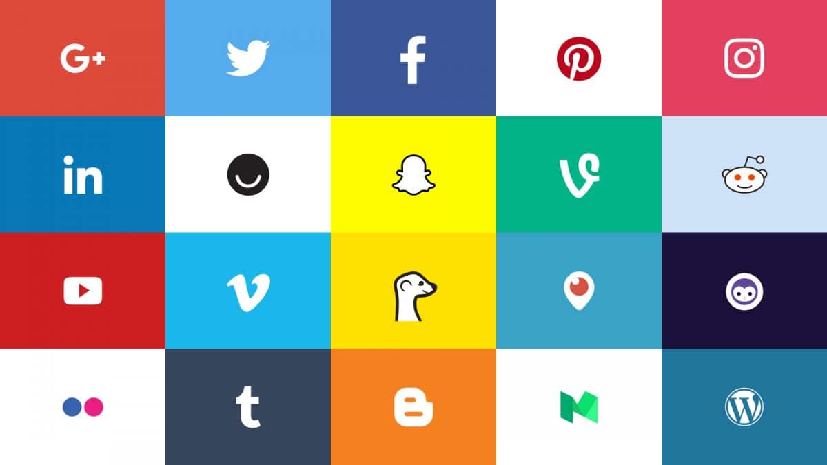
official social media logos updated


To understand what direction to go in for my app design, I need to study competitors design decisions and their winning formula. I can then take this methodology and input it into my design.


Image result for EVOLUTION OF GOOGLE LOGO

Looking at rebrands of companies who have rebranded their logo/typeface they have adopted a technique of less definitely being more. It's the top end companies that adopt this technique as it seems to convey quality and worth. 

Take Google for example, retaining their classic colour scheme, ditching the previous serif font and rendered in Product Sans, which was first spotted in the Alphabet word-mark. Which has now formed into a nice animated transition. You could say this new approach takes away Google's quirkiness, which is something I took onboard when creating my logo/typeface, as it can convey the type to look quite bland. But this is the modern approach to type and form. Just by looking at Google's history they have managed to dominate the market since opening their doors in 1998. The reason they are monopolising company they are today is because evolution is something they nail. So following their ideology towards branding I think is a smarter move forward.

Image result for EVOLUTION OF FACEBOOK LOGO

Other social media apps have adopted the same method. As time progresses their designs become more and more abstract and limited. It's straight to the point, losing textures, in some cases gradients and tones etc. Simply going for a two/three based colour scheme.


APP DESIGN RESEARCH

D-D Play - App Design | Abduzeedo Design Inspiration:

I like the way that they try and bleed the screen into the Phone, the phone UI always try's to define its boundaries, maybe it shouldn't?:

DESIGNING INTRODUCTION TO APP

Build a Feeling

Focus on simplicity, attach an emotion to your product


Tell Them When

The most important moment of a product is when the user opens it for the second time

Takeaway

  • Use Photos: Nobody is going to read lengthy text before they even know whether or not they want to use your product.
  • Use Words Strategically: Take a look at the examples and when they use words. Notice how they use words to enhance the images. In other words, they don’t expect the user to read the descriptions.
  • Don’t build a tutorial: Do that after they’re in the app. If you’re already teaching them about how to use the app without first telling them what the hell it is, you’re bound to lose some people. Keep in mind there are definitely cases where this doesn’t apply.
  • If you can, use a video: All those lines of code to build animations you can replace with a single video. Videos can be costly, but they absolutely do not have to be.
  • Focus on getting the user to use your product again: Tell them why they want to use it again, when to use it again, in what scenarios they should be thinking about it, etc.

Hi everyone! Besides my ongoing projects I like to create some concepts just for fun.  The app topics are often very similar and bringing them to life turns out to be much alike with everything alr...

APP PRODUCTION


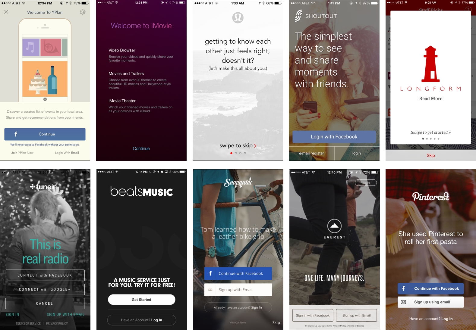
SIGN IN EXAMPLES APP

Image result for facebook sign up app
Image result for TWITTER sign up app

Image result for sign up app SCREEN

Image result for sign up app SCREEN


THE CLIENT

The Client:

All creatives, who study, practice or are even interested in different practices of design. With a particular focus on students. Universities/Education could integrate my app into the foundations of their studies. Creatives look for inspiration everyday, whether it be for work purposes or simply pure interest, sites such as Pinterest using my app as a resource, similar to sites such as; It's Nice That or Behance, however further developing on this.

I want to produce a creative hub. I want to design the Facebook of creativity. If you look at Facebook, it goes beyond a social networking app. It's original purpose was to connect with others, however it has taken a step beyond this. It is a social hub, for information, articles, news, life you can access pages of your interest and use the app to access information of your interest. It has become in a way a guide for people around the world, and an entertainment system.

 (1) the need to belong and (2) the need for self-presentation. The study also acknowledges demographic and cultural factors as they relate to the belonging need, and the variation of personality types on Facebook usage.

Facebook currently has 800 million users worldwide. According to the study, people use Facebook to fulfill two basic social needs: the need to belong and the need for self-presentation. Facebook use is also influenced by outside factors, such as cultural background, sociodemographic variables and personality traits.


has chatting feature like the Whatsapp.(Facebook has bought the Whatsapp actually now.)

has status feature like the Twitter.


has image feature like the Instagram.(Facebook and Instagram are synchronized.)

has video feature like the Youtube.

has the ultimate privacy features and is almost unhackable.


 has gaming features like gaming websites.

 shows recent news,advertises and pages of your interests.


the main acknowledgement here is it is a beautiful combination of all it's rivals. It has taken the focal point from each social media app and combined them into one. This is why facebook is the leading social networking app in the world. Incorporating these tactics into my production will only enhance my app.


Focal Points of my app:


Blogging function


News and articles (only creatively based)

e.g "We ask five top website editors and founders why they love online publishing

Briefs/competitions working alongside competitors such as D@AD etc.

An online shop where designers can sell/buy creative goods such as paintings, products/ posters etc.
(algorythms can be set up to deny this online marketplace of being a selling point for generalized products/services.)

Your own personal profile promoting yourself in any creative discipline.


PICTOGRAMS FOR SCREEN

Pictograms need to be simple and effective, and symbolise the specific intent, in a clean modern design, whilst providing two versions of custom bar icons, for both the selected and unselected.


LOGO DESIGN

We live in a Brand Era, where branding is in, and for some, aspiring to the Paul Rand style of logo craftsmanship is about as hip and contemporary as writing your invoices with a quill. Yes, logo design is only one facet of the powerful force that we call brand identity. Yes, a branded design environment can communicate sophisticated brand meaning without much (any?) usage of logos. But some ‘brand gurus’ or ‘brand evangelists’ seem to enjoy making hyperbolic pronouncements just to sound shocking or cutting-edge. Logo design is not dead. The technological advancements and tumultuous industries of our century are causing its role in our culture to evolve.

To understand what direction to go for app design, Studying competitors design decisions and their winning formula is vital so I can take this methodology and input it into the egg design.

Looking at rebrands of companies who have rebranded their logo/typeface they have adopted a technique of less definitely being more. It’s the top end companies that adopt this technique as it seems to convey quality and worth. 

Take Google for example, retaining their classic colour scheme, ditching the previous serif font and rendered in Product Sans, which was first spotted in the Alphabet word-mark. You could say this new approach takes away Google’s quirkiness, which is something I took onboard when creating my logo/typeface, as it can convey the type to look quite bland. But this is the modern approach to type and form. Just by looking at Google’s history they have managed to dominate the market since opening their doors in 1998. The reason they are monopolising company they are today is because evolution is something they nail. So following their ideology towards branding is a smarter move forward.


Other social media apps have adopted the same method. As time progresses their designs become more and more abstract and limited. It’s straight to the point, losing textures, in some cases gradients and tones etc. Simply going for a two/three based colour scheme.


Researching successful rebrands such as Google is appropriate before creating the egg logo however it was also important to look at failed attempts also to understand the fine line between what works and what doesn’t, looking into the failed rebrand of Uber’s logo is an example. Understanding why it failed is an important factor to include when undertaking the egg’s logo design. Uber failed with updating it’s brand image not following in the footsteps of pioneers of this trade like Google, over complicating the design this is something which needed to be avoided.


To understand how successful a logo is in it’s intent it should first work in black and white before anything else, it’s actual design is the fundamental importance. Of course colour only further enhances it but to make sure the design is strong this is a must. 

So initially creating a range of ideas to experiment with, it makes the selection process much more difficult however to produce the strongest design it is a neccessity. Ofcourse taking crits into consideration.

Feedback:

As it is a logo, it needs to be accepted and appreciated to every individual not just the creator specifically. Undertaking a crit was the only way to move this decision forward as a lot of time was wasted in trying to find a suitable design. These were the four most popular.

Overall the most appreciated and liked logo design, focusing on illustrating an egg design, using a soft mustard yellow colour, that seems warm and inviting, emoting positive conotations. The design has been tailored to the kinds of brands people see and interact with every day, particularly food, entertainment, sport and fashion – all of which require a design that appears approachable. 

The other reasoning behind choice of colour scheme is using the shades of egg yolk. 

Majority stating the design was visually satisfying and liked the concept of taking the egg as a visual motif. It was still difficult to select this design however as I created many which in turn made it that much more difficult in the selection process even for the designers in the crit. However this was the most preferred out of them all. 


LOGO DECISION:

This logo presented elements of a beautiful and memorable icon that could attract attention in the App Store and stands out on the Home screen. It embraces simplicity, which provides a focal point.Through thorough informed analysation/experimentation this was the logo chosen.


DESIGNING SCREENS