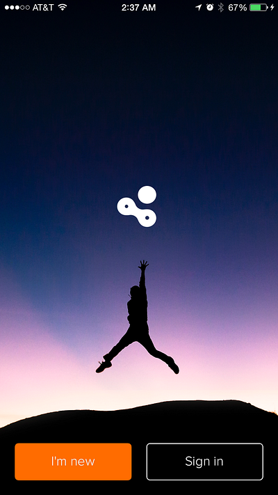
Build a Feeling
Focus on simplicity, attach an emotion to your product
Tell Them When
The most important moment of a product is when the user opens it for the second time
Takeaway
- Use Photos: Nobody is going to read lengthy text before they even know whether or not they want to use your product.
- Use Words Strategically: Take a look at the examples and when they use words. Notice how they use words to enhance the images. In other words, they don’t expect the user to read the descriptions.
- Don’t build a tutorial: Do that after they’re in the app. If you’re already teaching them about how to use the app without first telling them what the hell it is, you’re bound to lose some people. Keep in mind there are definitely cases where this doesn’t apply.
- If you can, use a video: All those lines of code to build animations you can replace with a single video. Videos can be costly, but they absolutely do not have to be.
- Focus on getting the user to use your product again: Tell them why they want to use it again, when to use it again, in what scenarios they should be thinking about it, etc.


No comments:
Post a Comment