
To understand what direction to go in for my app design, I need to study competitors design decisions and their winning formula. I can then take this methodology and input it into my design.

Looking at rebrands of companies who have rebranded their logo/typeface they have adopted a technique of less definitely being more. It's the top end companies that adopt this technique as it seems to convey quality and worth.
Take Google for example, retaining their classic colour scheme, ditching the previous serif font and rendered in Product Sans, which was first spotted in the Alphabet word-mark. Which has now formed into a nice animated transition. You could say this new approach takes away Google's quirkiness, which is something I took onboard when creating my logo/typeface, as it can convey the type to look quite bland. But this is the modern approach to type and form. Just by looking at Google's history they have managed to dominate the market since opening their doors in 1998. The reason they are monopolising company they are today is because evolution is something they nail. So following their ideology towards branding I think is a smarter move forward.

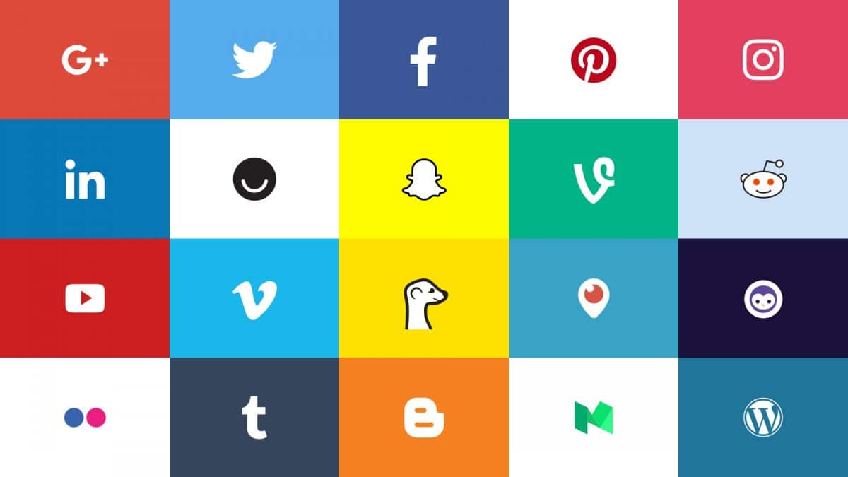
Other social media apps have adopted the same method. As time progresses their designs become more and more abstract and limited. It's straight to the point, losing textures, in some cases gradients and tones etc. Simply going for a two/three based colour scheme.
No comments:
Post a Comment