

I experimented with a few designs however I wanted to make it intriguing. I wanted the viewer want to pick up a leaflet, because for the target market I am going for with the digital age teenagers now prefer to look at their phones more than a piece of paper. And none of the designs above were really standing out for me. So I knew I needed a bold design that would stick out from the rest.

some early design draw ups to see how it could look and the layout/form.

So after I had to change my design decision because of the laser print problem, I had to quickly come up with a front cover piece, found this annoying as I felt the front cover dictates what the rest of the leaflet will be design as, seeing as its a 3 page fold also so I came up with this ‘GET HIGH AND DIE’ because I thought it would create an impact and stand out. Not elaborating that its about Heroin but just a simple bold message. However I really really did not like the concept nor the design. I tried cutting out the type with a scalpel however it just was not working for me. I had to change my design once again. Everything is off

So then I thought of creating a collage of injection needles over a repeated pattern as a front cover design. I like the simplicity of this design. Especially if it was laser cut, it could have been a very nice design. Giving nothing away as a leaflet just yet, just creating a simple layer to entice the reader, 9 times out of 10 you pick something up because of the design, if you received two letters with one elborately designed and another being your plain white envelope, which one are you going to open first?
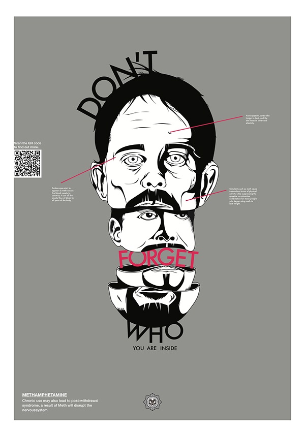
I really like the FRANK drug awareness posters, they are informative whilst still relative and contemporary in design and product. I admire they're designs so much that I want to make my design a follow up from their own product. They currently have released a number of posters based on certain class A’s and have not done one for Heroin so I am going to do a continuation which will allow me to practice with inputting advertising of brand as well, so I will need to work with advertising FRANK in the leaflet also.


I like the contrast in the mango to the black however the design is far too simple, I tried experimenting with different typefaces, trying to make it not too legible however I do not think it works as well as I planned, I inputted the chemical forumula for heroin in the brain stencil, subtle but I do not think anyone would really notice.
Overall I am not happy with my final outcome, due to a number of setbacks I faced in producing this leaflet, I was not able to produce something I particularly liked or enjoyed. Due to being told late about the laser cutter date, this really did completely change my design choices for this leaflet, and I do not think it did for the better. I ended up creating a simple stencil layout that seemed far too plain and simple for my liking, the front cover and follow up page look lost with no real depth applied. However from a context standpoint I believe I created an informative engaging leaflet, I am just unsatisfied with the design, it is not really my style.

No comments:
Post a Comment