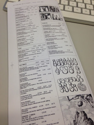
In preparation for this task you will need to select a takeaway menu to analyse and critique.
You will deconstruct the affect typesetting and layout has on the aesthetic, communication, legibility and readability of information.
Choosing one takeaway menu you will re-typeset the content to demonstrate your understanding of readability, legibility, information and editorial design.

While single column grids work well for simple documents, multi-column grids provide flexible formats for publications that have a complex hierarchy or that integrate text and illustrations. The more columns I created the more flexible my grid became.
Here is an overview of the new menu layout and design. Changed font to sans serif Abaldi font and inputted my logo rebrand.


Here is my menu printed out in final form. I much prefer this layout however I still thing with the use of imagery it detracts from overall layout making it far too confusing for a drinks menu.
No comments:
Post a Comment