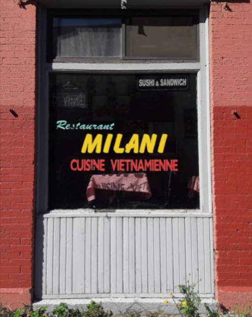
Over the summer, I visited Canada. In order to effectively demonstrate the effect and use of typography in a specific place, I decided to produce a publication specifically to Montreal instead of Canada as a whole. This will allow for more specific analysis and deconstruction, on how typography is presented differently to the country. Montreal is a unique city with a culture clash in tradition from English to French.
What is a sense of place? This question is an important factor to be able to demonstrate in the publication both visually and informatively. It is this question that made me decide Montreal for the publication.
Montreal's French-Canadian identity is hugely significant in making Montreal Montreal. Toronto has much to celebrate, and I do not wish to detract from that. But Montreal's wonders are utterly distinctive and frankly unique not only in Canada but globally.

What makes this location choice more interesting is looking at typography in a different language. Interesting how the language is maybe different but the style and typefaces displayed for certain uses run parallel to designs seen from home.
There is an interesting blend of styles to analyse, you have the more formal Helvetica dominant areas, widely displayed around the concrete jungles of Montreal, but submersed deep downtown the style and approaches change to a less formal, more artistically cultural view on typography. Far more adorning to it's own specific sense of place.
A problem found apparent through looking at the final images is the lack of resolution. This is going to be problematic during the printing process. A fear here is it will reduce the quality in the final resolution, the only way to work round this is to perhaps pay close attention to what scale the publication shall be printed on. Too large and the images may become to pixelated. However current design ideas will prevent the publication from being too small as a lot of intrinsic detail shall be involved.


No comments:
Post a Comment