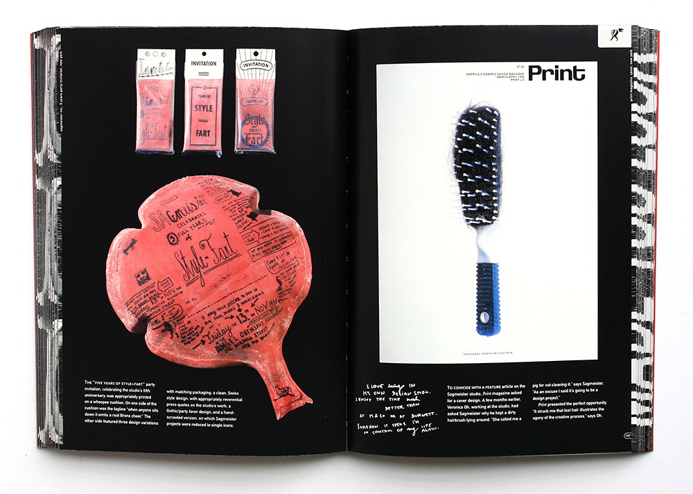
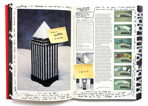
The Sagmeister book was an integral research source for this project. It’s message and intent was inspiring. It was a much different take on a photography book, it was raw and gritty, imperfect. In it’s own way a beautiful take on his own self expression splashed across the publication. Adopting these methods in my publication was completely fitting. As the publication is about urban typography which is a form of self expression. It made only sense for the main typeface to be of my own writing.


Other considerations taken from the book:
- use of negative space
- good use of active white space
- unusual interesting methods of illustration
- informed production techniques

No comments:
Post a Comment