

COLOUR SCHEME
(The colour portrayed on this document is not an accurate depiction of the colour scheme used for Our House’s branding)
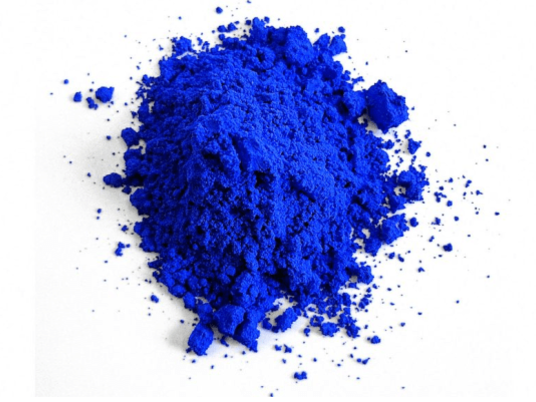
The colour scheme for Our House’ branding was based on recent news based on a Chemist Mas Subramanium, discovering a new shade of blue. This is the first time a new colour has been discovered for 200 years. The colour itself is vibrant blue.
This colour was chosen due to the story it represents, and how that ties with the emergence of Our House, and how we differ from our competitors. This new shade of blue is an emerging innovative trend. It’s bold and striking and has a sense of magnitude applied to it. These are all connotations that fit perfectly with Our House and the logo designed for it.
Another reason for the design decisino was due to a recent study on gender norms, University of Maryland sociologist Philip Cohen asked nearly 2,000 men and women a simple question: “What’s your favourite colour?” Blue turned out to be most popular across the board.
In addition, the colour blue conveys meanings of depth, trust, loyalty, wisdom, confidence these are all themes I would like Our House to portray.
- Depth in content.
- Trust in the brand
- Loyalty from our fanbase and customers
- Creative wisdom within the posts uploaded
- Confidence in how we approach and deliver content/products and general ethos within the business.
No comments:
Post a Comment