The choice to go for a minimal design was due to a number of factors. The majority of book designs for books based on Cosmology are normally over-complicated. They rely heavily on the image to promote the design of the book. Although they may use a large, bold san-serif typeface, the focus of the design is never really on the typography. By doing this, book covers move away from meaning and semantics, and convey a design more about filling something arbitrarily with decoration. This method has plagued books based on Science, by having a standard expectancy of what the cover should look like. Going for a minimal design goes against this ideology and offers something fresh and contemporary.
The market for books has been going with a similar style for the past few years. The industry recognises less is more. The majority of covers in recent years feature little type and little imagery, with strong contrast in colours to make the book stand out.
By looking at the context of space, what first comes to mind is the the vastness of the universe, filled with millions of galaxies, stars, planets etc. But what is never really conveyed is it’s vast nothingness. This is something I wanted to convey in my design.
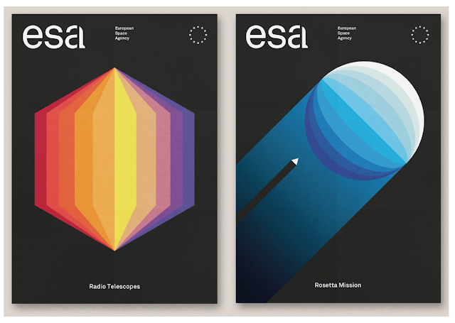
Inspirations for this project mainly consisted of a combination of these two styles. The image on the left was interesting as it depicted shape and type amazingly.
The above image is a rebrand of ESA. ESA is the European Space Agency and its mission is to shape the development of space exploration.
Both designs depict a strong visual display of time and space. It inspired me to develop my own designs with a similar style.


No comments:
Post a Comment